A Vacation Request example is like the "Hello World" of business process management (BPM) apps. With that in mind, we created an application template in Apex Designer to make it super easy for you to create one. It is simple, but covers basic concepts of process instances, task assignments and routing.
A set of videos is available here, including details of how to create your own app and a quick review of the components that it contains. The videos show how quick and easy it is to create task user interfaces for Camunda using Apex Designer, as well as covering some of the data-related aspects of process modeling. Read on for an overview of the application.
Introduction
To create your own vacation request process, just go to the projects page, click the Add Project button. Select the vacation request sample and fill in the name for your project.
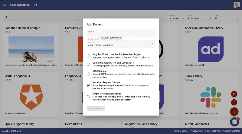
This video introduces the Vacation Request Sample app template including how to create it and a quick review of the components that it contains.
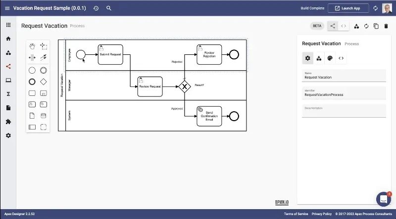
The app contains a relatively simple process design, where an employee submits a request and then a manager reviews it. If it's approved, we just send an email confirmation. But if it's rejected, we send a task back to the employee to review that rejection.
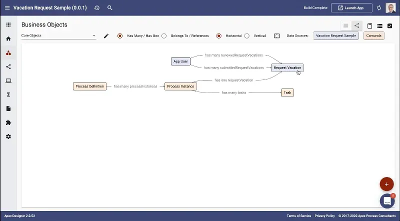
The information model used includes a mix of items specific to vacation requests, and more general process data items from Camunda, like process definitions, instances and tasks. The result is a mash up of two data sources, the Camunda database, and our application's database. Apex Designer handles the relationships between the objects from these two datasources and allows us to reference them easily.
Finally there are a set of user interfaces in this app. This includes task UIs for the submit, the review and the reject activities. There is also the task list, which is the main UI for users to interact with the tasks, and a set of administrative pages for Camunda admins to review process definitions, instances and tasks.
The Task List
Moving on to the end user experience, the Task List page has a Breadcrumb up at the top with a table of tasks. The tasks are sorted descending by when that task started. There's a refresh button that you can use to retrieve and update the list. There's also a button that is used to initiate a process.
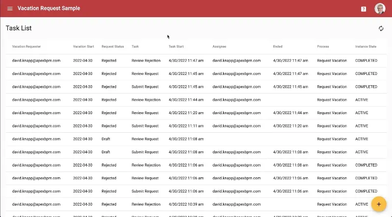
To take a deep dive into the design of the task list page, you can watch the video here.
Submitting a Request
Clicking the floating action button on the task list page initiates a request vacation process - a new process instance is created and the user is redirected into the task.
The user picks the start date (current date or later), how many days they're going to be gone and why they're going. Then they click submit, and the process moves on to the next step.

This UI is very simple, to see the design of the submit request page, watch the video here.
Reviewing a Request
Next, the reviewer receives a task to review the request in their task list. When the reviewer opens the task, they can see the name of the task and the process, along with the (read only) information entered by the requester.
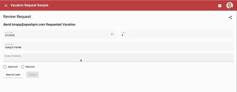
The icon in the top right opens a process diagram with the current activity highlighted showing where we are in the current process.
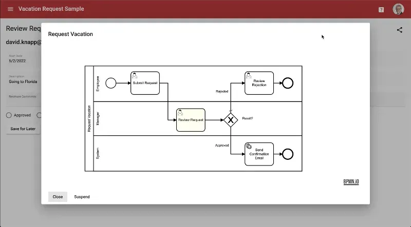
All of these are predefined components that can be added to the task UI in Apex Designer in just a few seconds.
The reviewer can either approve it or reject the request, and can add comments supporting their decision. The approve/deny selection has to be passed out of the task so that the gateway in the process behaves appropriately. This video will show you the design for the review request user interface, as well as explaining the data handling that goes on.
Request Rejected
No vacation for you!
What happens if the request is rejected? On the task list, the requestor receives a rejection task. Opening it, he gets the information.

Notice this page has slightly different buttons from the previous one - just to give a sense of what's possible. These pages can look very forms based or they can be very verbose with lots of extra text.
Take a look at the video of the design of the request rejected page to see more. for that.
Sending an Email with a Service Task
What about non-human (system) tasks in the process? The send confirmation email service activity is a service task, which means that the system is going to execute it.
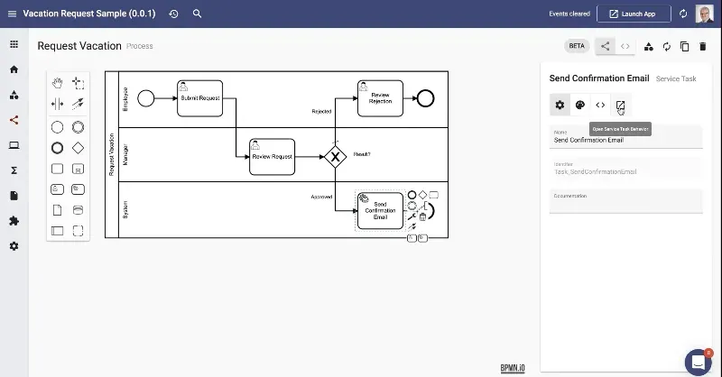
In the sample app, we don't actually send an email, but the send confirmation email function is a shell just waiting for your implementation. The external task handler calls this function whenever there's a task to process.
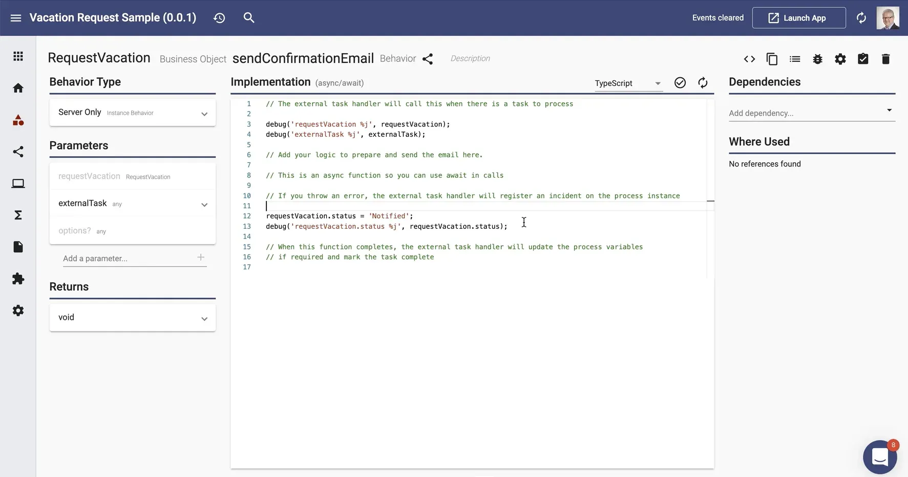
The send confirmation email function contains some debug statements and you can put your logic in between to prepare and send the email using whatever NPM packages or custom code you choose. This flexibility means you can use Apex Designer to build your Camunda processes while still using whatever components are your standards.
See the details of the service task implementation in this video.
Overview of the Process Definitions page
So far, we've been focused on the end user experience of the Vacation Request process. We also have some UIs aimed at system administrators. The side navigation option for Process Definitions takes us to a page showing all of the process definitions with their version, tag and version and resource information.
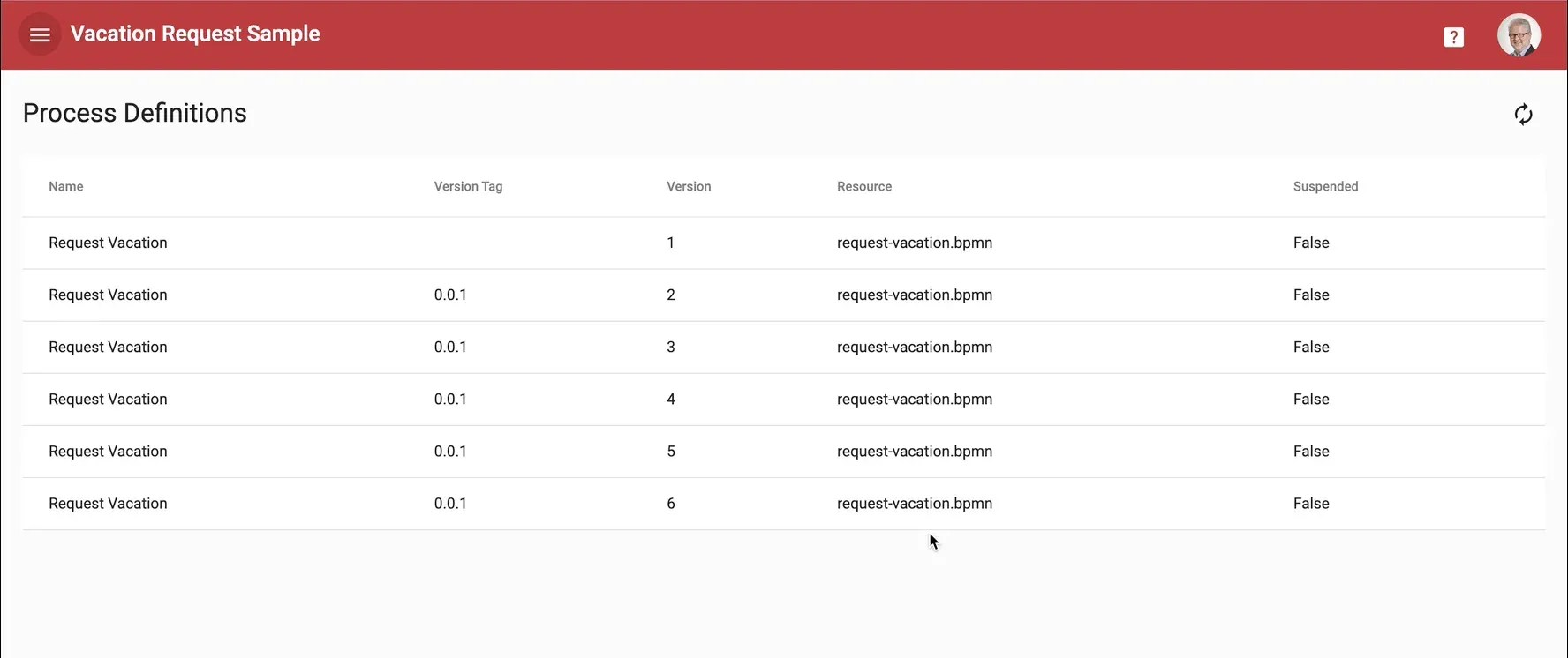
This page is the first example of how UIs for Camunda admins can also be easily put together using Apex Designer. Access to this page is restricted to members of the Camunda admins group.
See more detail of the design of this page in the video on the Overview of the Process Definitions page.
Process Definition Page
When the user is on the Process Definitions page, they can click one of the rows and it will open up that particular process definition. This page shows properties of the process definition, including the process diagram for the selected version. At the bottom it shows all of the process instances sorted by date, and also has the status of the instances and the completion times if appropriate.
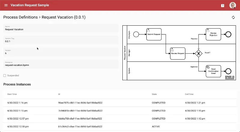
To deep dive into the process definition page, watch the video.
Process Instance Page
The Process Instance Page goes one level deeper and displays information about a specific process instance, including related tasks.
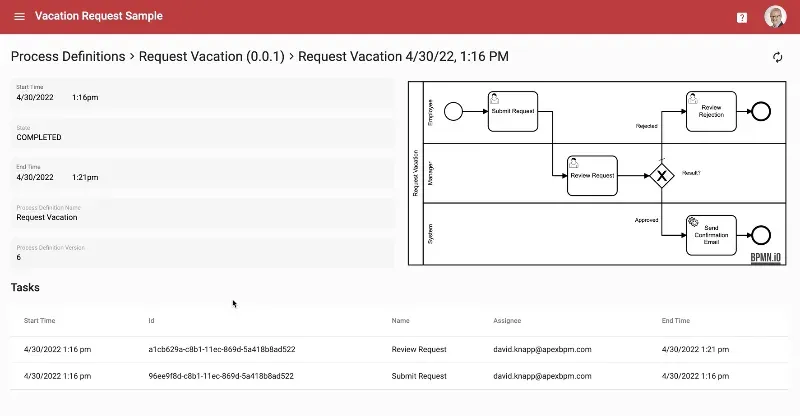
Again, all this information is retrieved from the Camunda database. See more details in this video about the design of the Process Instance page.
Task Page
From the process instance page, it's easy to drill down into the Administrative Task page. This is not an end user task page for completing a step in the process, but rather administrative access for re-assigning or modifying tasks . In this case we have a reassign task button that brings up a typeahead so that I can, for example, type in Kyle and reassign that task to Kyle. Behind the scenes, this uses the Camunda rest API to do the reassign.
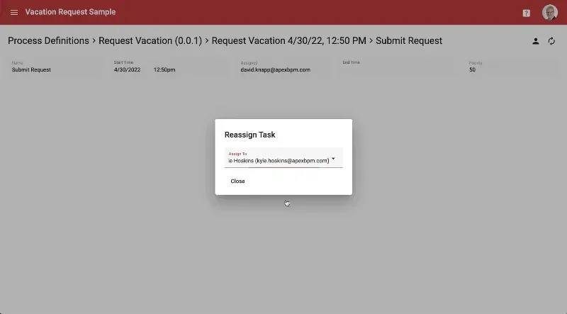
Learn more about the design of the administrative task page here.
All of these administration pages are intended as a sample to get you started thinking about how you could build custom administration capabilities using Apex Designer.
Toolbar Details
You will have noticed in all the preceding screenshots that there is a toolbar with left navigation icon, user avatar, and contextual documentation links. This toolbar is built from standard Apex Designer components, and can be modified to suit the needs of your application very easily.
To learn more, watch the last video in the series showing the toolbar design and details.
Summary
Hopefully this article has given you a good overview of the Vacation Request Sample app, and you have watched some (or even all) of the videos. Go ahead and create your own vacation request app from the template (you'll need to sign up for a free account at apexdesigner.io first), and let us know how you get on.


