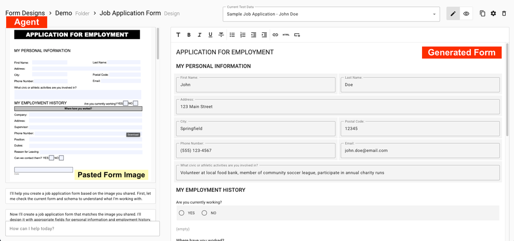
There is a temptation to do things the way you’ve always done them. I mean, they worked, right? But the reality is that when we are given new ways to perform our work, it’s best to revisit the whole premise in case there are efficiencies to be gained that would otherwise be lost.
There’s a word for design elements that refer back to outmoded predecessors. Skeuomorphism. When you see a little 3.5" floppy diskette as the “save” icon in a program, this is skeuomorphism. Nobody uses those disks anymore — and new generations of computer users will probably never even see or touch a 3.5" disk.

When you’re converting paper forms to online forms, the first inclination of most people who come from a paper background is to re-create the form’s layout to closely emulate the paper design. But before you fall into that habit, consider this question:
Why was the paper version of the form created with that particular layout?
The medium of paper limits how much information can fit on a single page. Your Apex Forms (and web forms in general) do not have this limitation. We’ll be talking more about taking advantage of web form layout tools for more effective form results in future posts, but for now, we’re going to talk about columnar layout.
What if you just made your form one big single column? If you are on a big widescreen, this kind of layout might seem a bit of space waster. But as users transition more and more to phones and tablet interfaces, the advantages of a single column layout begin to outweigh the desktop-centric designs. Let’s compare a couple of designs:

This is a simple wrap-layout. It’s clean but ideally, the submit button would be moved to the bottom of the form.

The same form, only now we are using column-layout, forcing all the page elements into a single vertical column.
Let’s see these same views on a mobile device.

Even the two-column view looks pretty good on mobile, but the single-column view on mobile is the cleanest and most useful design.

While both views are readable and usable, the single column view really looks sharper on the mobile screen. Bottom line is: Don’t be trapped in the idea that your forms need to look like their paper counterparts. The point is to accurately capture the information in a way that users find compelling and easy to use. A single column form is a good step towards clarity.


